The Chameleon
Designed by Andrew Before
Information Visualization and Aesthetics (INFO 424)
Displays that exploit the visual potential of relationships
Final display:

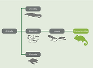
With these displays i'm trying to show the classifications of chameleons in relation to other animals. I also want to show the hierarchy that exists inside the classification structures. Chameleons are inside Iguania, which is inside of squamata (lizards) which is inside of chordata.
I used the failiar white text on grey or light green background found in my color model. I chose not to use a title based on where I thought this might go in my final infographic
First Iteration

version 1
version 2
Second Iteration

revision 1

revision 2
First Iteration
Critique #1: Jackson Brown
Jackson preferred the second version. I could add more to the tree. When doing this I could make the titles larger and the silhouettes smaller. I could add things that are related to chameleons. I could add annotations to define each of the classes. He thinks this version could use a title. This will help distinguish from evolutionary trees. Could change labels to something simpler that more people could understand.
Model Emulation Feedback
After looking at the base model he thought I could add annotations along with pictures on each.
Revisions based on this critique
From this review I originally added a title, but when I added the labels I felt that it didn't need both so I removed the title.
Critique #2: Diana Wang
Likes the silhouette representations to see what each class means. Might be able to put added extras into the first version. Could put the labels on the top of each. She likes the idea of combining both versions. If I don’t include the labels I would be better off including a title. Could maybe use an arrow to show direction.
Model Emulation Feedback
When I showed her my models she first noticed the use of photography. My base model uses it a lot but then she saw where the shillouettes are and thought that it could fit.
Revisions based on this critique
From this review I added the labels to show which column is which classification.
Critique #3: Myron Pak
Myron thought that the second version represented my data better. He said that I would maybe be able to include the classificaiton labels above. Since its a hierarchy he would like to see the shillouettes repeated up through the relationship. Another idea was that the first animalia was confusing and thought that it made more sense to just start at Reptilia.
Model Emulation Feedback
When I showed him my model he suggested using a dotted line to connect the relationship.
Revisions based on this critique
From this review I switched the solid line to a dotted line. I also added his idea of showing the hierarchy by putting animals in the more specific classifications into the previous classification.
Second Iteration
Critique #1: Peter Lu
Thought that I could use columns to create a more clear separation. Said that the titles seem to be floating up above and would like to see them maybe on the middle line, or made larger and more noticeable.
Revisions based on this critique
I decided to go back to the original version. I couldn't find a good solution for the floating titles, and it looked messy. With th enew version I left the titles ligned up to the left of the classifications.
Critique #2: Johnson Goh
Noticed that I’m focusing on the chameleon. This helps him focus on the main point. Also liked the addition of adding smaller subclasses to the previous classes. Could make the chameleon label larger and keep the font size the same.
Model Emulation Feedback
Johnson pointed out that my model doesn't have the underlined text that I used. I should get rid of the underline, and could replace it with bold, or a larger font size.
Revisions based on this critique
I removed the onderlining from text. In order to keep sizes consistent I moved the chameleon icon outside of its box.
Critique #3: Kaitlin Lockheart
Thought that I could use columns to create a more clear separation. Said that the titles seem to be floating up above and would like to see them maybe on the middle line, or made larger and more noticeable.
Model Emulation Feedback
When I showed her my models she thought that the lines should be smaller, and maybe white instead of green.
Revisions based on this critique
I decided the best solution was to go back to the other version. I tried all suggestions, and it just looked cleanest to go this way. I tried the white lines but they were too difficult to differentiate from the background.